mast·head
/ˈmastˌhed/
noun
1. the highest part of a ship’s mast or of the lower section of a mast.
2. the title of a newspaper or magazine at the head of the front or editorial page.
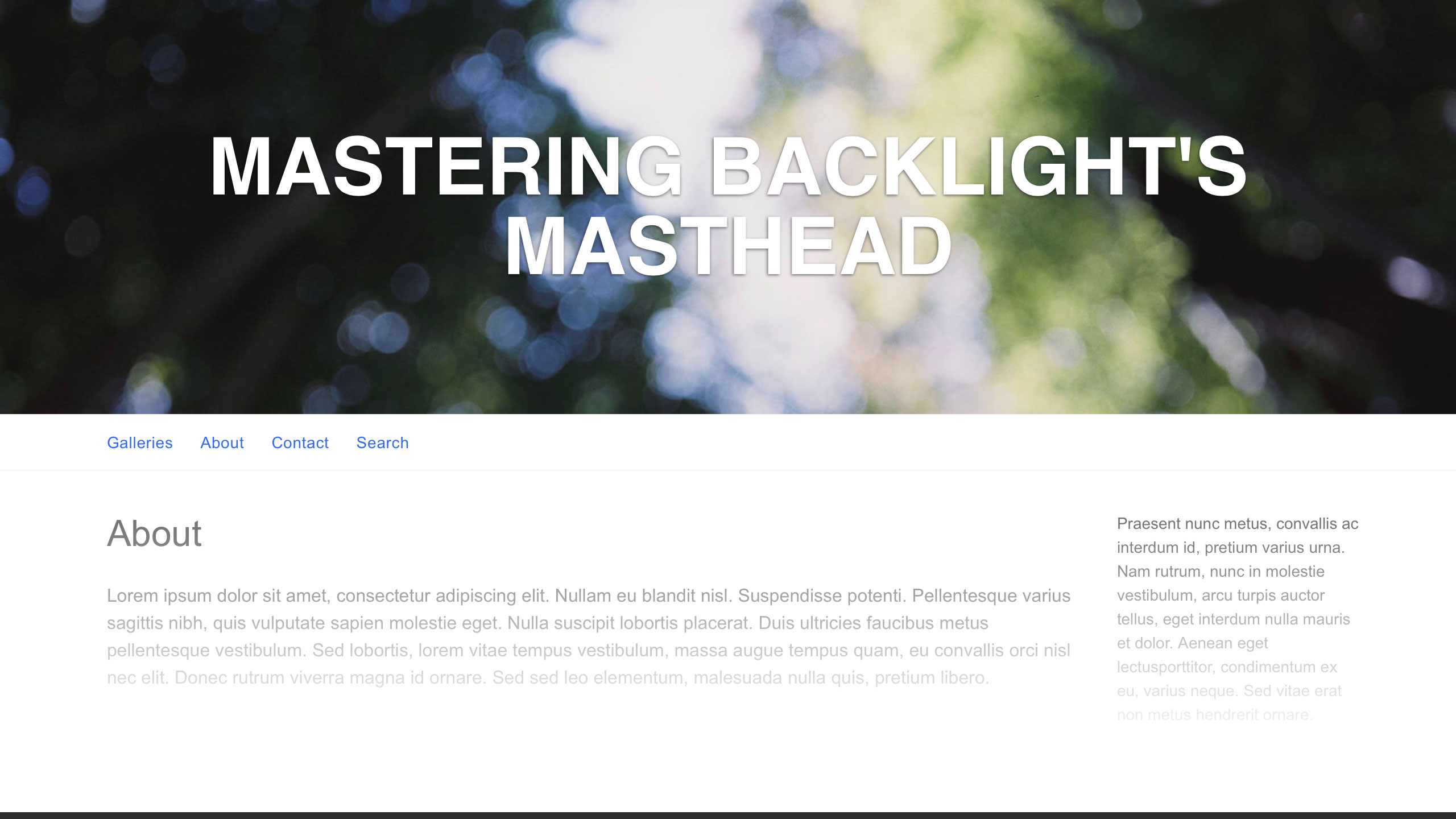
“Masthead” is a term we’ve borrowed from print publication. In Backlight’s Pangolin modules, the term refers to the page template’s header, and is of utmost importance in your design. The vast majority of the time, the masthead is the first thing your site’s visitors will see, even before they see your images. That being the case, it’s important to get it right.
In this article, we will discuss some rights and wrongs of masthead design, and how to make the most of Backlight’s options for customizing your masthead.
The Masthead’s Purpose
The purpose of the masthead is to establish location and brand. It lays out your name, the name of your business or website. When people land on your site, it tells them where they are. And as they navigate your site, it lends cohesion to your pages, albums and blog posts, communicating to the visitor that they have not meandered on to some other place.
In one way or another, the masthead should convey a sense of the work that you do. We will be revisiting this idea throughout the article.
In Backlight’s Designer …
Let’s do a quick overview of the masthead customization options in Backlight’s Designer.
The Masthead control group is subdivided into several sections: Identity, Top Pallet Title, Primary Masthead, and (optionally) Secondary Masthead.
In the Identity section, set your text and typeface (font-family). These settings will be used in all masthead locations: top pallet, primary and secondary. Choose whether to hyperlink the masthead. Commonly, clicking the masthead will return the visitor to the site’s Home page, or the front page of a blog.
In the Top Pallet Title, set whether to display the identity text in your top pallet, which is the bar that runs across the top of the page, unless otherwise disabled. We usually stock the top pallet with buttons for social media, cart or client response features, and quick search. Be mindful of your feature set and whether it allows space enough to properly display your title in the top pallet, especially at mobile display sizes. Depending on your design and/or feature set, you may want to use this feature, or you may want to skip it.
By default, the identity text does NOT appear in the top pallet.
With the Primary Masthead controls, you can design the site’s header or banner. These are the meat and potatoes of the Masthead control group, and there’s a lot you can do here.
The Secondary Masthead controls are hidden by default. When switched on, you get another full set of controls identical to the primary masthead set, allowing you to create a second header.
And that will do for an overview.
Choosing an Appropriate Typeface
When in doubt, Helvetica.
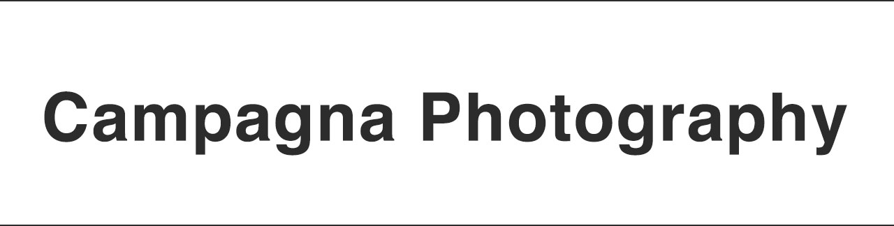
Some may argue that Helvetica is overused, but there’s good reason the typeface gets so much play. It’s an absolute classic, classy as hell, and widely applicable. It remains legible and gorgeous at all display sizes, large or small, and it’s eminently professional. Even if you plan to replace it, it’s a great place to start. There’s good reason it stars in so many design books, and is the topic of a feature documentary. Therefore, when in doubt, Helvetica.
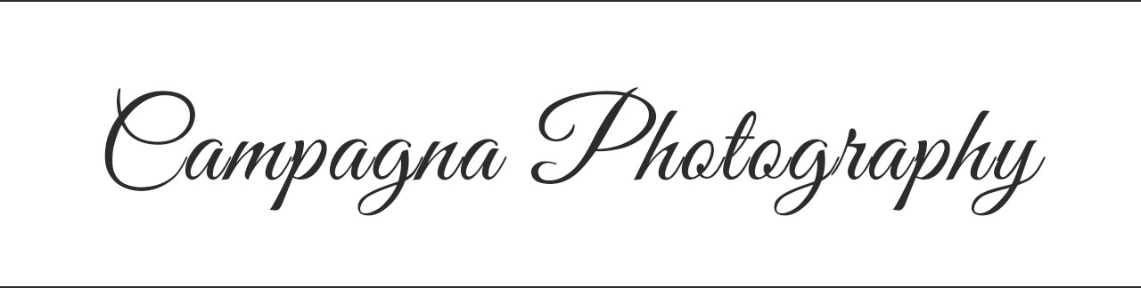
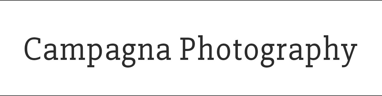
If/when moving on from Helvetica, your chosen typeface should convey a sense or a feeling consistent with the mainline of your photography. For example, a decorative typeface lends itself more to wedding photography than to documentary; for documentary, you’d probably want something slab.
If rendering your identity in text, rather than as a graphic, and wanting to use Google Fonts, check out our Google Fonts instructions for Pangolin.
In the end, whatever typeface you choose, do not Papyrus.
Seriously. DO. NOT. PAPYRUS.
On Logomarks
I like logomarks. I use a logomark here at The Turning Gate, designed by a graphic designer some years ago, and you can see it in our masthead. It’s simple, but I think it represents us well, and that’s what is most important. If you use a logomark, it has to be a good one. A bad logomark makes a bad first impression. On every page of your website, that bad impression can diminish and devalue your work as a whole.
I won’t name names, but I’ve seen them. Bad logomarks. Generic clipart smashed in front of titles. And I groan.
It’s an opinionated statement to be sure, but a tasteless masthead communicates that you are a tasteless photographer. No logomark is better than a crummy logomark. So if you use one, make sure it’s one that you’re proud of.
On Banners
A safer, potentially superior option is the photographic banner.

One should be wary how banners will expand or contract with display size. For example, your text might get very small when the banner appears only 320-pixels wide on an older iPhone. Backlight allows you to set background and foreground layers separately, which can help to alleviate such problems, as demonstrated in the following video.
Using the Primary and Secondary Mastheads
Backlight also allows you to design two separate mastheads, for simultaneous or conditional display. One of the best uses of this feature is to display one masthead at desktop display sizes, and a different masthead at mobile display sizes.
In the following video, I demonstrate how this can be achieved. I also delve into a second scenario, where the masthead appears in a sidebar column on desktop, but then moves into the main column on mobile, to ensure the masthead is always up-front when the visitor lands on the page.
Additional Tips
When creating title graphics, include 12-pixels of padding on the left and right sides of your text. I neglected to do this in the video above, which is why my text graphic abuts the edge of the screen at the smaller display sizes. I think it’s far nicer to have a little bit of space to keep text off of the display edge.
Most modern browsers have a responsive preview mode, similar to what I’m using in the videos above to get an iPhone-like view. Here I’m using Safari, but these options also exist in Chrome, Firefox and Edge. Delve into the browsers’ Developer Tools and get familiar with this feature. It’s a fantastic utility to have at hand when using Backlight’s designer.
High-resolution displays, such as Apple’s Retina displays, require larger images. Text graphics will appear blurry, with soft edges on Retina displays when not of adequate size. If the display size of your text graphic is 400-pixels wide, then design your text 800-pixels wide. Save the file at this size to use as your 2x, high resolution version, then save a separate file at 50% scale (400-pixels wide) to use as your 1x, standard resolution version.
If you have any further questions how to master your mastheads, ask away in the comments below!