The blog has been quiet these last few months, while we’ve busied ourselves working on our next big update, Backlight 1.2. While we’re not yet ready for release, we are far enough along now that I can begin to preview some of what we’re working on.
When we speak of “Backlight 1.2”, we are being somewhat reductive. It’s not just the core Backlight application getting an update, but all of its modules and add-ons as well. The update focuses heavily on Backlight’s designer, and includes overhauled versions of our core Pages, Album Sets, and Albums modules, and the Theater and WordPress add-ons. Also, updates to the Cart and Client Response add-ons to improve implementation of those features in the new 1.2 modules, as compared to previous versions.
Stated broadly, you can expect brand new features, presentational improvements, a more intuitive design workflow, and greater flexibility in design. Also, more user-friendly and engaging websites for your visitors.
To make some specific examples, I’ve loaded our latest build onto my CampagnaPictures.com domain, which is these days more a sandbox than a website.
So, here’s just some of what’s new …
Contact forms now support Google’s reCaptcha spam prevention mechanism, which you can see on my Contact page.
For albums, the Classic and Masonry layouts have been updated, (hopefully) made easier to use. And there’s the new “Justified” layout, much requested by Backlight’s users, and which you can see in my demonstration gallery.
The “Justified” layout arranges images into rows, scaling the images to like height to ensure flush left and right sides. It’s an attractive and modern grid layout, that most emphasizes landscape-orientation images. With the Masonry layout emphasizing portrait-orientation frames, and the Classic layout being neutral, the Justified layout nicely rounds out your options.
In an effort to reduce visual clutter, I’ve also made big revisions to our handling of iconography on the page. The changes manifest most significantly in the display of icons over thumbnails, and in the top pallet.
Icons over thumbnails are now initially hidden, and reveal themselves when mousing over an image. This includes add-to-cart buttons, select buttons, feedback buttons, etc. Exceptions to this behavior are color labels and active selects, as these are most useful being visible at all times.
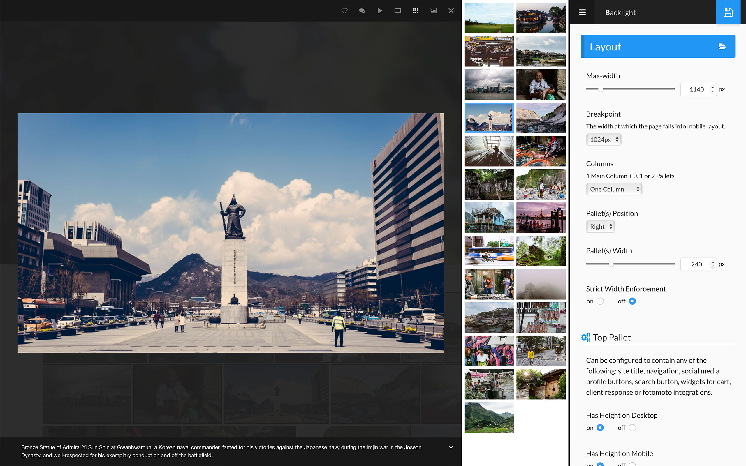
The top pallet is the fixed-position bar at the top of the page. It holds our widgets for the cart, client response and Fotomoto features. In the mobile layout, it also contains the triggers for opening the side pallets.
The widgets adhere to a common visual language, and open to reveal toolboxes. On the demo page, click the client response widget to see its toolbox in action. Toolboxes help to keep the top pallet well-organized and uncluttered, and free up space for other purposes.
New in 1.2, the top pallet may contain your site title and navigation, social media icons, and a search button. Widgets also stack more nicely; for example, if a visitor has items in a shopping cart, then visits a client response album, the cart and client response widgets fit nicely side-by-side.
Mastheads have been completely redesigned. If you so choose, you may create a masthead similarly to how you might have done before. But you have many new options now at your disposal. There are now separate layers for the site title and background; you may have a text or graphical site title or logo, and then a background image. For those liking banner-style mastheads, this allows the two to scale independently, so that your titles don’t get squashed on mobile. You also have the option to define your masthead’s dimensions by maintained aspect ratio.
You can have just one masthead for all occasions, or you can design a secondary masthead. So you might have one masthead designed for large, desktop displays, and a separate masthead for smaller, mobile displays.
View the demonstration gallery at both desktop and mobile display sizes to see this in action; I’ve set two visually distinct mastheads to very obviously show this off, using different images. The desktop masthead uses very large text for the site title and a 2:1 aspect ratio, while my mobile masthead uses a smaller font-size to prevent the title wrapping to two lines at the smaller width, and a 16:9 aspect ratio.
In my demonstration, the masthead is also not hyperlinked. So your masthead can now be unclickable, or you set a custom target, allowing your visitor to click through the masthead to whatever destination you choose, whether your Home page, your blog, or elsewhere.
The last thing I’ll talk about is the slideshow itself. We previously used Photoswipe for images, and Magnific Popup for popups (client response features, add-to-cart, etc.).
In Backlight 1.2, we’ve replaced both with a single library, the new Fancybox 3. So the slideshow has been redesigned, and includes some new features. But the thing that excites me most is that we can now call up the cart or client response popups directly from the large image view, without exiting the slideshow. This makes for a far smoother user exerience.
That’s a small taste of what’s to come. There’s more we will reveal in time, so of which will be more obvious to you when you get to use the designer, rather than looking at the resulting design.
Originally, I had hoped to be launching these updates in April. At this point, mid-to-late May is looking more realistic, though. Regardless, you should be hearing from us soon.