We often arrive at simple solutions by complex routes. Backlight 1.1 now lies on the horizon, a major project milestone that we are rapidly approaching. It’s taken us a long while to reach this point, and along the way, I have made many atrocious, overly complicated attempts at designing a logomark for Backlight. To date, my many failures have left us using only a simple logotype, the word “Backlight” rendered in the Lato typeface, with the letter “B” slightly heavier than the rest of the word:
We had a project before we had a name. It’s now well past a year since we started to call it “Backlight”, and for all that time I’ve been trying to come up with a logomark, shouting for inspiration, with only the distorted echoes of my own impatience and bad ideas coming back in reply.
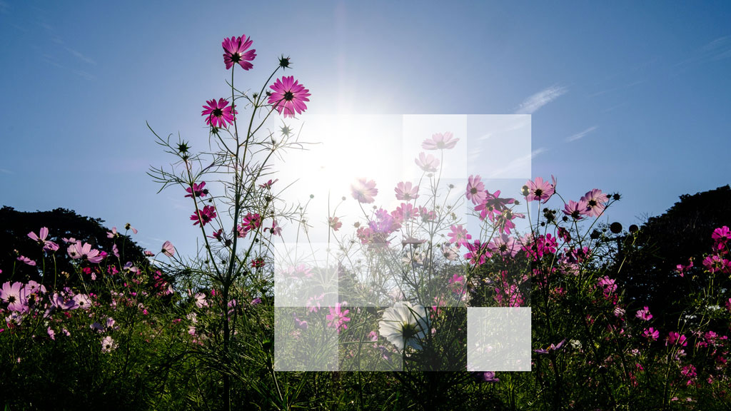
In mid-October, I spent a few days in Japan, and there I was pointing my camera into the sun, because I work on a product called “Backlight”. I was taking photos like this one:

And with the sun in my eyes, I began to see the light, the logomark that I already had:
By removing the color, and shifting the position of the largest square, the sun …
The diffusion of light outward from its source …
Then a brightening of the opposing corner, to mimic a lens flare …
And that’s Backlight’s new logomark! From concept to completion, it took several iterations for refinement. Like The Turning Gate’s logomark, I’m able to render it as an image file, or using a combination of HTML and CSS, which allows it to be highly versatile. And being square, I can use it as a favicon or app icon, as well as in my masthead. We love it, and you’ll be seeing it soon in Backlight 1.1.